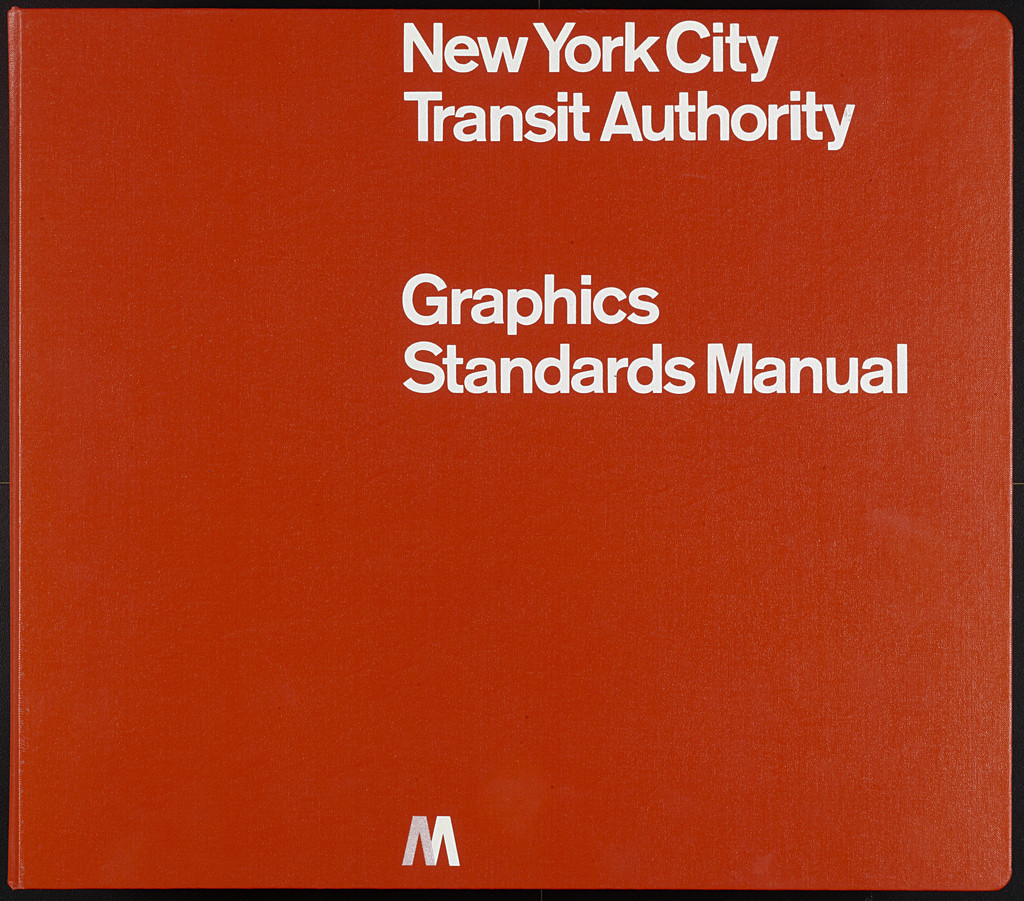
New York City Transit Authority Graphics Standards Manual
Massimo Vignelli
Italian, 1931–2014
Unimark International Corporation, New York
American, established 1964
Bob Noorda
Dutch, 1927–2010
1966-70
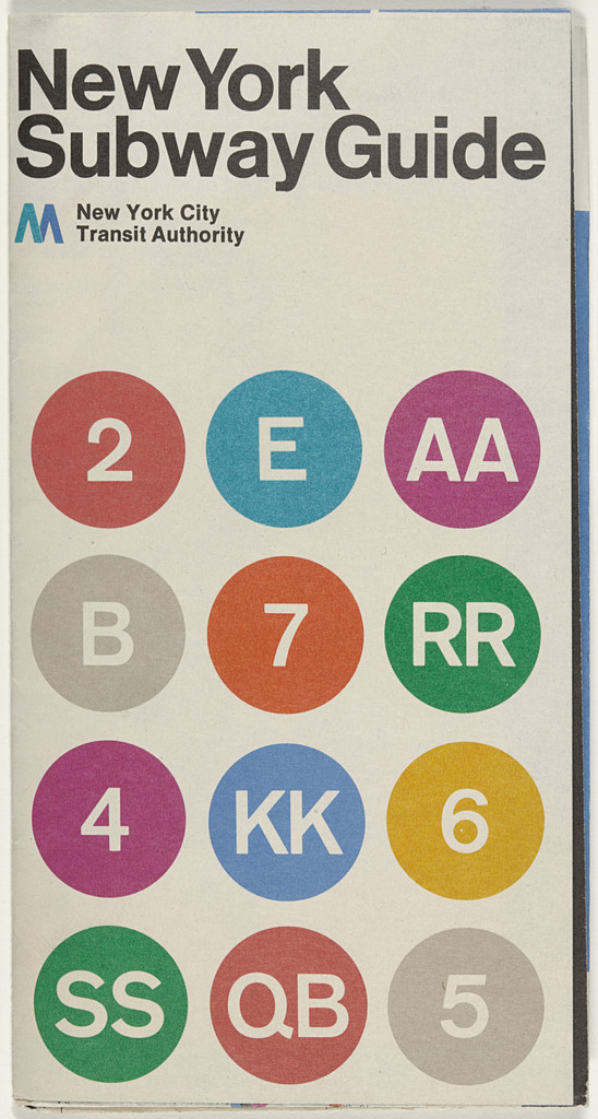
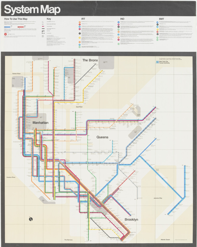
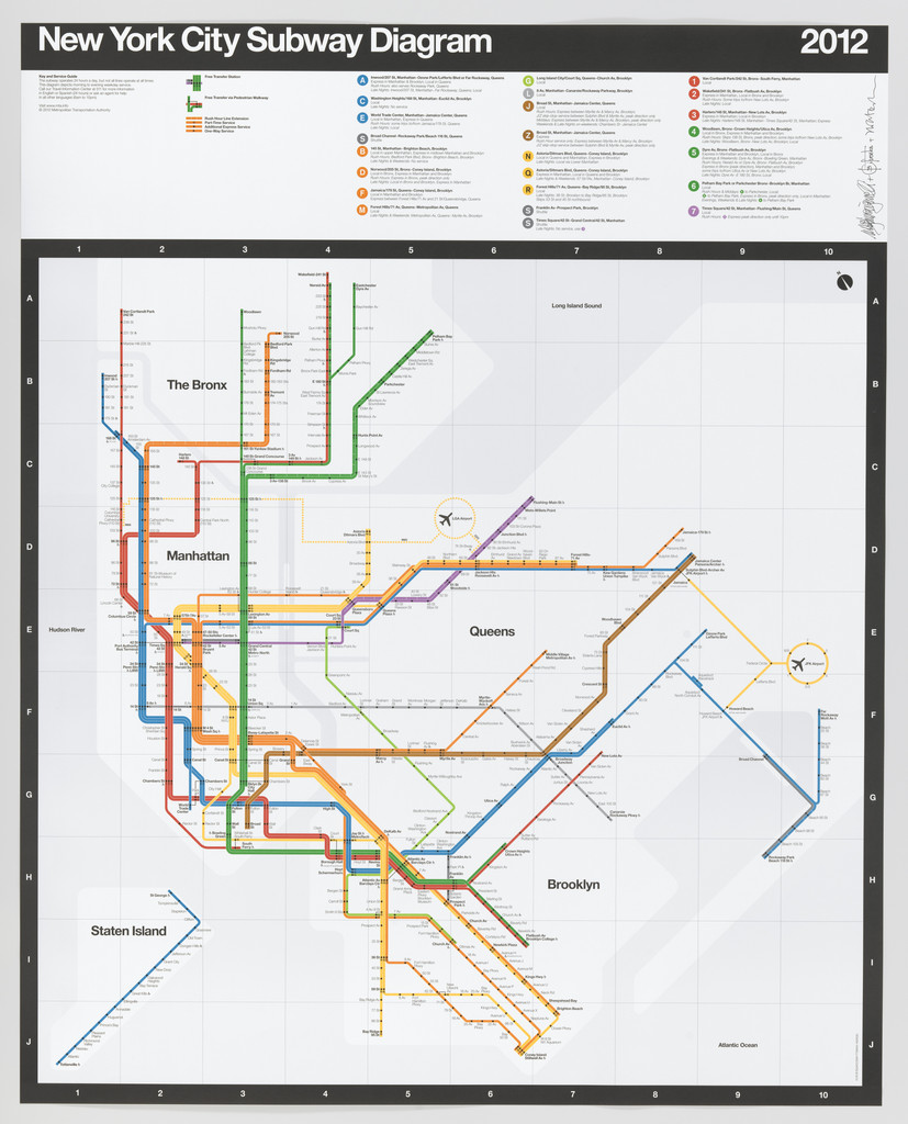
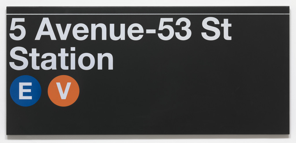
A lithographed manual with a screen‑printed binder by Massimo Vignelli that sets out a unified visual system—type, color, signs, and symbols—so the New York City Transit Authority could present a clear, consistent identity and make the subway easier to navigate.
The cover greets you with a bold, solid red field and crisp white sans‑serif lettering set with generous margins and a small 'M' emblem, announcing order and clarity at a glance.
A landmark of modernist applied design, the manual helped formalize graphic standards for public infrastructure and shaped how cities worldwide use typography and signage to organize and communicate complex information.
Medium
Lithograph with screenprinted binder
Dimensions
13 5/8 x 15 1/2 x 2 7/8" (34.6 x 39.4 x 7.3 cm)
Classification
Department
Credit
Gift of the designer
Accession
374.2004
Palette
Exhibitions
