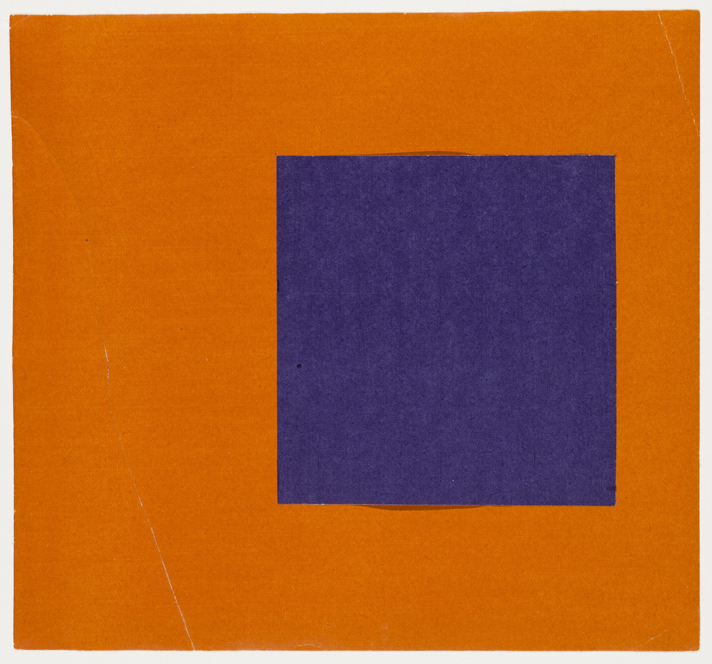
A purple square sits on an orange field. That's all. Look at it long enough and the square starts to lift off the page. The edges hum. Something happens at the boundary between the two colors that your eyes can feel but your language can't quite catch.
Kelly made this in 1951, the year he came back from Paris full of ideas about getting rid of everything art didn't need. No brushstrokes. No emotion performed on canvas. No narrative. Just two colors meeting. But notice the edges of that purple shape — they aren't laser-cut. Someone's hand was there. The precision is willed, not manufactured, and the difference matters. A machine makes a boundary. A hand makes a decision.
The purple here has no symbolism. It doesn't stand for royalty or grief or spirituality. It's purple the way a frequency is a frequency — a specific wavelength of light bouncing off paper into your eyes. Kelly wanted color to be a fact, not a feeling. He trusted that the fact was enough.
And it is. Stare at the place where purple meets orange. Your retina does something involuntary — a low flicker, a vibration right at the seam. You didn't decide to see that. The colors decided for you.