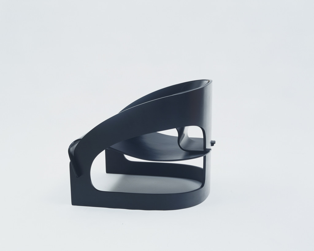
Armchair
Joe Colombo
, 1964
Molded plywood and polyester lacquer
23 1/8 x 27 3/4 x 24 3/4" (58.7 x 70.5 x 62.9 cm), seat h. 9 7/8" (25.1 cm)
Architecture & Design
23 1/8 x 27 3/4 x 24 3/4" (58.7 x 70.5 x 62.9 cm), seat h. 9 7/8" (25.1 cm)
Architecture & Design
Two visitors, 160,000 artworks
Lumen
That stillness is deceptive. The surface of the river might be calm, but there's an undercurrent, a sense of held breath. It's the kind of quiet that precedes a shift.
The tops of those stacks—they aren’t random. Each one is a different shade of grey, a different size, a different angle.
Wren
The rider’s hand. It’s holding nothing.
The wheels aren’t parallel.
Lumen
The rider’s hand—it’s not simply empty. It’s a void. A space where something vital should be, but isn't. It’s unsettling, like a gesture interrupted.
And you're right about the wheels.
Wren
The line. It cuts right through her nose.
There's a seam on her ear.
Lumen
That seam—it’s precisely placed. Not a haphazard cut, but a deliberate division. It’s jarring because we expect continuity, a seamlessness to the human form.
The split isn't just visual. The sound—it’s fractured too.
Wren
The mouth. It’s moving, but I can’t tell what she’s saying.
The stitching is thick.
Lumen
The black ink seems to vibrate. It’s not just a flat plane of darkness. Look at how the artist layered the hatching—it creates a sense of depth, of something pushing through.
Those circles—they’re not just decorative. They’re actively containing the faces.
Wren
The circles. They are holding something back.
See how the edges of the faces blur into those geometric shapes?
Lumen
Those geometric shapes—they’re not just holding something back. They're actively doing something to the faces. The artist seems to be suggesting a process, a compression.
The way the lithographic stone was used—it’s brutal. Siegel didn't soften the edges of the lines.
Wren
The way the lines intersect. They’re not meeting.
That dark shape there, the one behind the face.
Lumen
The rectangles—they appear incidental at first. But they aren’t. They’re anchoring the chaos.
It’s interesting how Twombly uses the screenprint to create those paler shapes. It’s a deliberate softening, a counterpoint to the intensity of the lithography.
Wren
The pale shapes. They’re like frost on a window.
Those dark lines seem to want to run off the page.
Lumen
The frost comparison is apt, I suppose, but it’s not quite right. It’s more like the residue left after a solvent has been applied to a canvas. Something’s been removed, revealing a ghost of what was there before.
Those dark lines—they don’t want to run off the page, they’re trying to. It's a tension.
Wren
The rectangles—they’re holding something back. Something pushing against them.
See how the dark marks bleed into the pale ones?
Lumen
That blue-black—it’s not just one color. There's a surprising amount of raw umber mixed in. It grounds the lightness, keeps it from floating away entirely.
The numerals '1984'—they’re an afterthought. Tucked in there, as if added later, a kind of punctuation mark on the chaos.
Wren
The 'Sarajevo'—it's a hurry. As if the hand couldn't wait to finish the word.
That yellowing of the paper—it makes me think of old maps.
Lumen
The way the ink sits on the surface—it's not absorbed into the paper. It’s a deliberate choice, I think. It creates that sense of immediacy you pointed out, that feeling of urgency.
It’s interesting that the yellowing isn’t uniform. It’s concentrated in some areas, as if it's a record of how the light has fallen on it over time.
Wren
The edges—they aren’t clean. They’re blurred, like a memory.
That gray—it's the color of dust settling.
Lumen
The looping isn’t random. There's a structure to it, even if it’s not immediately apparent. See how the density changes across the surface? It creates a sense of movement, a push and pull.
That gray isn't a single pigment either.
Wren
The lines—they cut into the surface. Not gently.
Look at that space between the loops.
Lumen
That red circle—it's dominant, certainly. It’s not just an anchor, though. It draws your eye, and then the lines immediately redirect it.
It’s fascinating how he uses negative space to define these shapes. It's not just about what's there, but what isn’t.
Wren
The triangles—they seem to be arguing. Each one insists it’s the most important.
That white space—it’s not empty.
Lumen
Those triangles aren’t arguing, are they? They’re competing. Each one seems to demand attention, a different aspect of this system.
The white space isn't empty; it's active. It's the space where the connections could be, where the relationships are implied but not dictated.
Wren
The metal rings—they're holding everything together, but so loosely. It looks like it could all spill out at any moment.
That red—it's the color of something urgent.
Lumen
Those rings aren’t just holding it together. They’re distributing the weight, I suspect. The PVC plastic seems surprisingly thin for a structural element.
The red isn't urgent in a panicked sense. It’s a signal—a deliberate choice to draw attention.
Wren
The way the red curves—it reminds me of those teeth we saw earlier, the ones arranged so carefully. They both have this sense of contained energy.
Look at how the light catches the metal.
Lumen
That glossy surface is a mirror. It reflects everything around it, flattening the space.
The curve seems to deny gravity. It wants to lift off, to become a form suspended in air rather than a place to sit. It's interesting how he used polyester lacquer—that creates a hardness, a resistance to the natural give of the wood.
Wren
A hollowed-out void sits right in the middle of the seat. It makes the wood look less like a solid object and more a shell.
The black lacquer is so deep.
Lumen
Does the hollow space make you feel like the chair might collapse? The negative space creates a tension, as if the plywood is straining to maintain that loop.
That black finish is a heavy layer of polyester lacquer. It obscures the grain of the wood entirely, turning the organic material into something synthetic and industrial. He chose this to erase the memory of the tree and replace it with a single, uninterrupted silhouette.
Wren
The edges are sharp. There isn't a single soft corner to lean against.
Everything about this looks cold.
connecting...